Reflections
-
 Shreya BhosaleMember, September 10, 2026 at 8:58 pm
The results of these searches on Google Images give us a selection of images based on what is already available, widely circulated and searchable online, as well as what it predicts users are likely to want from that search.
The searches for “teacher” and “CEO” are quite telling. They are dominated by professionally produced, posed or stock photographs rather than photographs of actual teachers or CEOs going about their work. These are images designed to be inserted into presentations, websites, articles, assignments etc. So Google Images is responding not only to the meaning of the search term but moreto the way people commonly use image search: to find a generic visual representation that can be reproduced or reused, commercially or otherwise.
The results for “terrorist” reveal a different problem. Mostimages are associated with terrorism by Islamists, and a number of them are book covers rather than photographs of particular terrorist acts or individuals. Somewhat showing the associations that have accumulated around the word whether through news media, publishing, political imagery or pop culture. So its obvious that it is not just that Google is “biased”, but that a search engine can reproduce and reinforce associations that are already dominant in the material it indexes. If a particular image or association has been repeatedly produced and circulated online, it becomes more likely to appear as a representation of the concept.
“Beautiful woman” works in another way. The results are largely women who are already socially established as beautiful, particularly celebrities such as Deepika Padukone, Priyanka Chopra, Zendaya and Margot Robbie. The search seems to retrieve women who are already highly visible and repeatedly represented online as beautiful. Beauty becomes tied to celebrity, popularity and cultural recognition. An ordinary woman who may be considered beautiful by the people around her is unlikely to appear simply because she is beautiful. And again, what is beauty? What are the definitions?
All in all, these searches show that Google Images is obviously not a neutral window into the world. It is shaped by what people (which?) photograph, publish, label, circulate and search for, and by the algorithmic systems that rank those materials. Telling us as much about the internet and its users as they do about the words being searched. Google Images does not show us reality; it shows us the representations of reality that have the most visibility, usage and searchable online.
-
sudakshinaMember, September 10, 2026 at 6:52 pm
I think about the rice seed cyanotypes. Rice seeds can be photographed from a biological perspective (as a plant), an agricultural perspective (as a crop), ethnographic perspective (local diets & part of local culture in the forms of usage in rituals), as travel documentation and for art which is what the artist has done.
-
LaurenMember, September 9, 2026 at 2:40 pm
Session 6: Beyond Institutions: Photography’s Expanded Relations
Besides in museums and galleries, I’ve encountered photographs out in the streets in the form of information boards that tell people about the heritage of a particular place. Seeing the photographs close to the real-life landscape or buildings where an event took place makes the photos feel “alive” for me in a different way; I can better picture what a particular place looked like when having a photo close by to compare features. For example, in Cape Town, South Africa there are boards in Heritage Square with photos and maps to explain what the area was like in the early days of the City of Cape Town, and how the townscape has changed over time. The town of Venaria Reale, part of the Metropolitan City of Turin, Italy, has several boards on significant people and places, for example a courtyard which used to be used to water horses when the Royal Palace of Venaria Reale was the seat of the Savoy royal family.
-
LaurenMember, September 2, 2026 at 7:59 pm
Session 4: Images in Community: How Photographs Travel
Trace one photograph across fi ve platforms. What do you notice about how each platform has presented the photograph? How does each platform make you read the image differently?
I traced a photograph titled “Group of Young Bhutias”, attributed to Fred Ahrle. I first came across this photograph on the website of DAG (formerly the Delhi Art Gallery), as part of its exhibition “Typecasting”. In the context of a professional website by a cultural institution, the historical background of the photograph can be given, which helps the viewer in beginning to understand how and why this photograph came to be. In the article about the exhibition from the newspaper “The Hindu”, the photograph appears again, presented as a small sample of the photographs that can be seen at the full exhibition. I feel that the article takes seriously the intentions of DAG in presenting part of its collection of ethnographic photographs, even though the viewer can’t access more information through an interactive link as on the DAG website. In this case, the photograph acts as an invitation to the viewer to learn more about this photograph and its history (including that of ethnographic photography), and also to learn more about the other photographs in the exhibition.
The same photograph appears on the image portal Alamy, accompanied by the text shown in the image at the link below: “This photograph captures a group of Khasi teenagers in 1865, showcasing the attire and cultural practices of the Khasi people in Meghalaya, India. It reflects the social and cultural aspects of the time.” The photo has Alamy watermarks over it, situating it in the “gallery” of an image licensing portal. It does not mention the context of the ethnographic album which in which it was compiled, its more recent history as part of the DAG exhibition, nor who the photograph was attributed to. It is simply an historical photograph which can be licensed for some purpose that the licensee has in mind. In a similar context to the article from “The Hindu”, the photograph also appears in an Instagram post on the DAG’s page, as part of a sample of photographs which promote the “Typecasting” exhibition. The photograph is accompanied by a brief explanation (necessitated by the nature of the platform) of the exhibition, thereby keeping it contact with its historical context to an extent. Other users may choose to circulate the image of the photograph without that context, which is not the fault of the DAG, but instead a possible side effect of a platform such as Instagram. Lastly, the fifth platform is the physical space of the DAG itself. While I did not see the exhibition in person, I would imagine that I would feel the metaphorical “weight” of the object, since I would be able to see its texture and colour. I feel that in this space, there is also an opportunity to contemplate more of the photograph’s agency: in what pattern I might move around the gallery space, how much time I spend in the area where it is displayed, how its placement “interacts” with the photographs around it, for example.
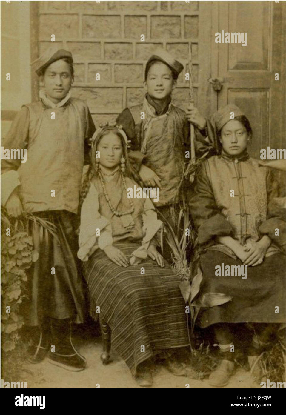
alamy.com
Download this stock image: This photograph captures a group of Khasi teenagers in 1865, showcasing the attire and cultural practices of the Khasi people in Meghalaya, India. It reflects the social and cultural aspects of the time. - J8FXJW from … Continue reading
-
LaurenMember, August 28, 2026 at 7:44 pm
Session 3: Whose Images? Representation, Visibility, and Rights?
Take a look at the photographs in today’s newspaper — without reading the captions. Are you able to make sense of the subjects portrayed here?
Before reading the photo captions, I was able to identify the broad category of the subjects portrayed, in this case, people waiting at a government office to be (hopefully) assisted with accessing a service. The headline already mentioned the South African Social Security Agency (Sassa), and I am aware of its yellow branding. The formations in which people were sitting or standing also gave an idea of the subjects; people were standing and/or sitting mostly in single lines or multiple rows of chairs. Their clothing also gave an idea, since they were dressed in coats, hats, closed shoes, long pants, etc., indicating waiting for a long time in the cold weather (it is currently winter in most parts of South Africa).
Can you still identify which subjects are victims? Read through the captions and reflect on your interpretations.
The people standing or sitting, wrapped in winter clothing, were those I could identify as “victims”, which was confirmed after reading the captions. I have put the word “victims” in quotation marks both because of people experiencing what I would argue is a type of state violence (with deep-rooted problems stemming from South Africa’s horrific history of colonialism and apartheid), and because people are still trying to do something to make things even somewhat better, despite the obstacles stacked in their path.
The expressions on their faces and often their posture pointed to their being portrayed as the “victims” in the photos. Their mouths are set in straight lines, some have furrowed brows, and some have looks of concentration on their faces. Some seem bowed against the cold or perhaps against the exertions of travelling long distances early in the morning, only to be unable to receive help that day.
Sassa grant reviews strand beneficiaries in systemic chaos
-
Drew PetyMember, August 24, 2026 at 10:37 pm
Session 2 – Unstable Objects: Photography, Social Change, and Dissent
Choose a historical photograph. Find three versions of this photograph online.
Note any differences you see between these versions.
How has cropping impacted each version of the image?
How has cropping affected or changed the politics of this image?
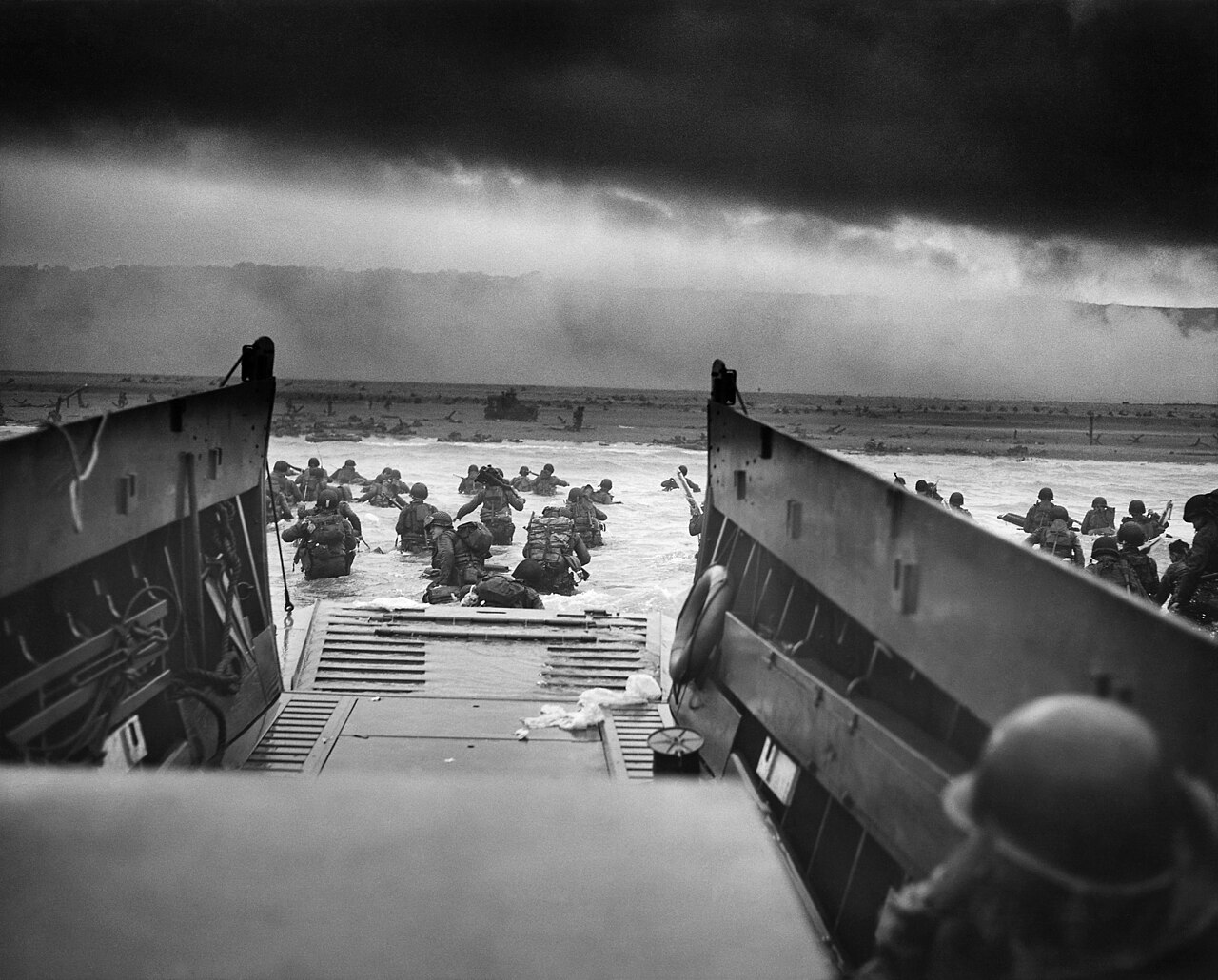
I’ve selected the photograph titled “Into the Jaws of Death” by Robert F. Sargent, taken June 6, 1944. The image depicts American soldiers disembarking their landing craft, wading through the water to storm Omaha Beach during the Normandy landings of World War II. The first image is the original, the second is cropped to focus primarily on the soldiers toward the center of the frame, and the third (printed as a comforter?…) is cropped to make the image vertical and highlight only the scene framed by either side of the military landing craft.
Compared to the original, the second image is zoomed-in and appears to draw attention to the only soldier whose face we can see, as he’s turned almost 90 degrees, showing his left profile. Here, we can only see a small portion of the beach and none of the background beyond it, nor can we see the sky, which adds an ominous element to an already dire scene.
The third image not only seems to lessen the seriousness of the events taking place, considering it’s been made into a comforter for a bed, but—along with the second image—does not depict the scale of the scene that’s unfolding. These two images could be showing just one boat worth of soldiers, rather than what’s shown in the original, where we get the sense that there are numerous landing crafts in play, with—what is likely—many more soldiers.
By cropping the original, the second and third images seem to lose some of the intensity. Granted, it’s still a war scene, but with the second image, for example, we cannot see the background and sky, which happen to add—not only to the composition—but the overall mood of the image. As mentioned, the dark sky is rather ominous, and the sunlight that does break through the clouds and onto the beach, makes the photo appear particularly well-timed. And with the third image, by framing the scene between the sides of the landing craft, the image seems much more planned, as opposed to the imperfections of the original, which makes it feel much more candid, taken amidst the chaos of a literal war scene.
source 1: https://en.wikipedia.org/wiki/Into_the_Jaws_of_Death
source 2: https://commons.wikimedia.org/wiki/File:Into_the_Jaws_of_Death_23-0455M_edit_(cropped).jpg
-
Drew PetyMember, August 24, 2026 at 10:35 pm
Session 1 – Seeing Historically: Photography, Knowledge, and Power
Find an ethnographic photograph from the 19th century.
What information does it appear to give you? Write down your observations and inferences.
Based on the image itself, we have an indigenous man sitting on a horse in a desert-like environment. The horse stands among—what appear to be—yucca plants, with other various desert plants as well, and maybe some rocks near the horses front legs. It’s an overcast day, with signs of the clouds darkening (or clearing up; a glass half-full or half-empty scenario). The horse looks fit and sturdy, facing camera left, with its ears relaxed, slightly lifted, possibly listening to what’s behind it. The man’s body is facing forward, with his head turned toward his left shoulder (camera right); hard to say where his eyes are looking. He’s also fit and sturdy; shirtless; with a bandana-like cloth around his head, with what could be a feather sticking out the back (again, hard to say); he’s also wearing a light colored loincloth. The horse is wearing a bridle, with the man holding the reins.
Then, list five things you cannot know from looking at this image.
Again, based solely on the image, we do not know if the image is staged or candid; for all we know, this could be a businessman posing as a Native American; furthermore, I’ll add, we do not know if the man is indigenous/Native American or not. Without context, we don’t know the intention or purpose of this man on horseback: he could be on a leisurely ride or a scout surveying the countryside (as mentioned in the caption). We also don’t know where exactly this photo is, since there are no discernible landmarks. Lastly, we do not know what the photographer was trying to say or show.
What questions does the image leave you with?
I’m most curious about where this image was taken, who this man was, and what was the purpose/intention of the photograph. With that being said, the image is from an article that does present more information, and was taken by a well-known photographer, so the answers could be out there, but I went into this prompt blind, in an effort to provide thoughts based only on the photograph itself.
source: https://clacs.berkeley.edu/us-mexican-war-forgotten-foes
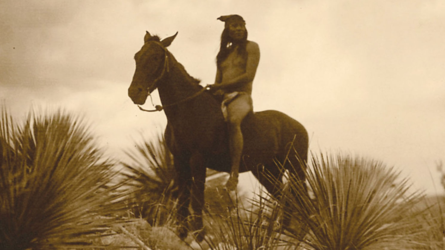
clacs.berkeley.edu
THE U.S. - MEXICAN WAR: Forgotten Foes
Unearthing the forgotten role played by Native Americans in the U.S.–Mexican War with historian Brian DeLay.
-
LaurenMember, August 23, 2026 at 12:29 am
Session Two: Unstable Objects: Photography, Social Change, and Dissent
I found three versions of a photograph showing Mahatma Gandhi leading a group of people during the 1930 Salt March, which was part of a wider campaign of civil disobedience to protest British rule over India. The first version of the photo is close-cropped and seems to create a point of focus on Gandhi and was found on a blog site as part of a header image. The second version was found here: https://www.alamy.com/stock-image-scenes-during-mahatma-gandhis-famous-salt-march-this-march-on-foot-162592623.html. The second photo shows more of the people who marched alongside Gandhi and gives an idea of the place where they marched (as foliage is shown in the background). The third photo shows a colour version of the photo, also from a blog, which has cropped out the man with a moustache on the far right of the Alamy photo. I think creating a focus on one person visually perhaps also focuses — whether intentionally or not — on one person’s story and therefore agency. Adding colour to a photo may help to create a wider appeal to audiences of different generations who may be more used to seeing colour photographs. However, this may also make the photograph more difficult to date, as the original all-over colour and/or texture of a photo may tell us about what photographic process was used, thereby giving an approximate timeline of when the photo was made.
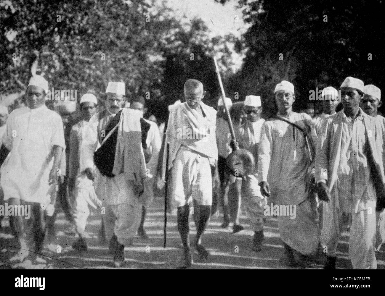
alamy.com
Download this stock image: Scenes during Mahatma Gandhi’s famous Salt March. This march on foot to the sea coast at Dandi, on the eve of the Salt Satyagraha, 1930. This peaceful resistance was part of Gandhi's Non-violent opposition to British … Continue reading
-
LaurenMember, August 19, 2026 at 2:27 am
Session One: Seeing Historically: Photography, Knowledge, and Power
Questions about the photograph: Why did the photographer choose that particular backdrop, table and vase of flowers as the props appearing with the boys? Who decided on the pose? Were the boys uncomfortable while holding the pose, assuming that they might have had to stay still for some time during the development process? Who decided what clothes and jewelry the boys would wear?
-
LaurenMember, August 19, 2026 at 2:20 am
Session One: Seeing Historically: Photography, Knowledge, and Power
The photograph is titled “Two Maratha boys from Akalkot”; by Hurrychund Chintamon, India; 1867, found on the Encyclopedia section of Impart, by the Museum of Art & Photography (MAP), Bengaluru.
The two boys are the focus of the photograph, judging by their position at either side of the photograph. The photograph appears to be posed, rather than spontaneous. The backdrop behind them looks like that from a photographer’s studio, since it is plain aside from a “classical”-looking vase that reminds me of architectural decorations on classical or neo-classical buildings. The lighting draws attention to their garments and detailed jewelry (e.g. the delicate chains that connect to a ring worn on one finger). The textiles making up the garments looks like a type of Indian brocade embroidered with zari. The boys appear to come from a wealthy family, judging by their garments, jewelry, accessories (perhaps more accurately weapons?) and the fact that the photograph is formally posed inside a photographer’s studio.
I cannot tell if the climate of the area where the photo was taken influenced the comfort of the sitters during the session, and if it influenced the development of the photo itself. I cannot tell if the boys were willing to be photographed or obliged their parents/caregivers. I am unsure if the studio was in the same area that the boys came from, or if they travelled a long way to reach the studio. I don’t know whether the photograph was taken for a family album or other purposes.
-
Niharika SaikiaMember, August 18, 2026 at 6:48 pm
Session One: Seeing Historically: Photography, Knowledge, and Power.
I selected this particular picture: Group of Moorish Women, Algeria, Africa, Antique African Photograph, 1893.
Possible observations:
- A group of women are positioned together.
- Their bodies/clothing are visible.
- The women appear to be deliberately positioned for the photograph.
- Their clothing and bodily presentation are significant visual elements.
- The photograph appears posed rather than being a spontaneous moment.
- The framing draws attention to the women as a group.
- The image is identified through a geographical/ethnic designation: “Moorish Women.”
- The date places the photograph in the nineteenth-century colonial era. What I cannot know from the image:
- I cannot know what the women were thinking or feeling.
- I cannot know whether they wanted to be photographed.
- I cannot know what happened immediately before or after the photograph.
- I cannot know how the women themselves understood their identities.
- I cannot know the photographer’s intentions simply by looking at the image.
The image leaves me with the following questions:
- Who took the photograph?
- Why did they photograph these women?
- What did the photographer want the viewer to see?
- Did the photographer instruct them how to pose?
- Did the women know why they were being photographed?
- Did they have any control over how they were represented?
- What power relationship existed between photographer and subjects?
- Is the image participating in a colonial way of looking?
- Who was the intended audience?
- Was it sold or circulated commercially?
- Was it used for ethnographic purposes?
- Where did it travel?
- How did it eventually enter an archive/collection?
-
This reply was modified 1 month, 2 weeks ago by Nikhil. Reason: Edited to fix styling issues
Log in to reply.